Coursework
NEA coursework
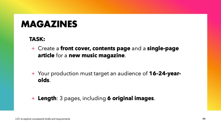
LO/
to explore coursework briefs and requirement


Do Now:
- non examined assessment (NEA)
- no
- no
- 30%
- You need codes and conventions in order to make your NEA realistic
Friday 13th June 2025
NEA research
LO/
To research the codes and conventions of similar products

Cover analysis:
- The person on the cover is Billie Eilish; the shot type used to represent them is at least a close up or medium close up
- The cover lines include topics such as: 50s music dying out (possibly for an older audience), something about a country singer (?), starting your own business (?), and Eilish's rise to fame
- The main image is monotone, with white and turquoise highlights
- the masthead is also turquoise in a sans serif font dominating the left side of the cover
- The price, date, and website is positioned below the masthead
- Most of the font type is sans serif with differentiating thicknesses and heights- excluding the 'with a' connectives which is in italics and serif font
- there are no puffs
- It's laid out pretty sparsely with all the cover lines pushed to the right ( the masthead on the left)
- The only image is of Eilish
- The texts are all of varying topics suggesting billboard has a diverse audience

- The article is laid out as a three column page with other picks of text at the bottom
- only one image is used ( taking up most of the page)
- The main typography is in a serif font; at the bottom of the page is changes into sans serif (connoting the contemporary music artists of the year - stays on theme)
- There's a couple colloquial subheadings ( I can't see the other page so the rest of the article is a little ambiguous to me)
- The colour scheme is a contrasting sea-green to an off-white, beige background; the image also having similar highlights of the sea-green
- Eilish is represented in a minimalistic (what seems to be a ) bedroom ( connoting familiarity or relatability)
- Eilish poses a bit more of a masculine aesthetic; her main music genre is indie (alternative)/ pop so she's presented a little more laid-back ( not easily identifiable as to what she does) and simple
- The ideology presented ( after reading snippets of the article )

- The main image: south-east asian representation; medium close-up ( allows readers to see her. face and style); her expression is kind of 'ponderous' ( links to 'welcome to beatopia); her clothing isn't too glamorous- indie, laidback);
the background is the dry outdoors ( connotes heat, being lost, ect); colours in the main image makes the main line stand out ( connotations are a little Alice in Wonderland, " high", possibly nostalgic?);
- Cover lines and masthead: most cover lines are block capitals sans serif; main cover line- looks as if it's been drawn on with a marker
-
Music magazine: different genre conventions:
Pop:
- bright colours
- probably looks a little expensive
- modern
- feminine
Hip Hop:
- dark colours
- Bold fonts
- masculine
- maximalist
Indie:
- Mellow and bold colours
- simplistic
- 'low-budget'?
Folk:
- woody, greenish, warm
- simple
- older audience?
Rock:
- very bold
- weirdly alien
- expensive
Metal/ Punk:
- maximalist
- garish
Rock'n Roll:
- older audience
- bright, 'unusual' colours
Jazz:
- Formal, classy
- dark and academic colour and style
Magazines that I like: ( on powerpoint)
MUSIC MAGAZINE CONVENTIONS ( that I stole off of someone else!!)
Definition of codes and conventions: They are what makes something and are the key to the genre or style of such media.
- Masthead: typically the name and the logo of the magazine- they differ depending on the genre of magazine (e.g. rock: bold, hard, weirdly static; pop: soft, a little bouncy, modern etc)
- main cover lines: these tend to match the characteristics of the person on the front cover; made to draw attention to the reader
- Cover lines: typically stories of various musicians: whether it's gossip and drama, concerts, new music, emotional stuff, emerging or old songs, industry stuff- music magazine can talk about anything as long as it links to music one way or another
- Tagline: not exactly to draw attention- it could be something like ' special' or 'British' edition
- Colour pallets: A music magazine has no universal target audience; it's usually matches to fit the cover star and what their theme is in the photo ( feminine colours like pink or soft pastels to fit perhaps a pop, alternative or even K-pop type musician)
- Layout: the layout is usually suited to the genre: a magazine that does any or every type of music may have it rounded to connote it has every genre, whereas a rock or hip-hop magazine is more scattered and packed in; I have also noticed that a selection of more minimalistic magazines have information to the side making a [ or ] shape
- basic information: barcode, price, date etc

Cover analysis:
- Masthead: the masthead is the classic rolling stones magazine ( red, bold, cartoonish font)
- Image: The person on the image is Adele ( she is in a medium close-up): Adele's music can be pretty melodramatic, she is a pop, soul and R & B; this is connoted towards her facial demeanour- it's serious, her mouth is parted and she directly looks at the reader ( a sort of contemplative or momentous way- awestruck even?); her hair is styled messy and wind-blown, I think it's supposed to connote her exaggerated theatrical theme to fit with her music ( considering how Rolling in the Deep came out in 2012); her makeup is also a little theatrical in sense, but still ' minimal' in the way it's presented: rosy cheeks, heavy eyeliner and lashes- even the lighting in the photo makes her eyes greener. Her face is also titled upwards a little connoting status- which links to the article.
- Coverlines: ' THE REAL HOUSEWIVES OF WALL STREET', this intertextuality links to the American soap opera- it's meant to grab the reader's attention, make them feel smarter for understanding the reference, and become curious as to what the piece is about ( Wall Street is essentially the heart of finance and capitalism, the cover-line is basically telling you a behind-the-scene story about the people living in it): 'BILL MAHER', Bill Maher is a talk-show host on politics and America- he's humorous and uses satire to engage his audience- an interview would make the reader interested ' THE MOST HATED GIRL ON THE INTERNET', ( the extension blocks this one so I can't actually see who the article is about, but that means I can get the reader's perspective of looking at the cover for the first time), the hyperbolic language and ambiguity used would definitely interest the audience, who is the most "hated girl on the internet"? And considering the time when this magazine just came out, the internet would have been a place where everybody would see the same content, the the hyperbole probably would not have been lying. Overall, the cover-lines meets a range of audience, they obviously expect intelligent and sophisticated people ( politics, economics etc), but they are also assuming that their audience is very mainstream with the media references and "internet gossip" ( possibly looking at a younger target audience).
- Colour pallet: the colours used creates a mostly mellow and or 'sophisticated' theme to it; but in addition, there is the glossy red of the masthead: this probably reinforces their brand name, but it also oddly makes the magazine look minimal and yet again smart-looking.
- Main cover line: ' Adele: HEARTBREAK SUPERSTAR', the single lining of her name reinforces her own widespread image ( the audience automatically knows who she is); her name is also the only line not in block capitals connoting that she doesn't need anyone to support her own name, it also just makes her name stand out on the cover. 'Heartbreak superstar', this whole title heightens her status and recognition ( Heartbreak- connoting to the genre of her music; superstar- in the way there are supermodels- is seen by for their talent and has a wider branch of fame than those of the title of just a 'star')
- ' SPECIAL ISSUE: BEST OF ROCK 2011' : this hyperbole broadens The Rolling Stones status as a mainstream magazine
The Article: ( since I don't know how to find the contents page)
- Layout: the article is laid out with all the information and text plastered too one side of the page, and Adele's face on the other
- Image: the image is a close up of her face, she is looking away from the text; the only difference is that it's as a black and white portfolio; the first thing connotes her independence and the fact that she is the main focus of this magazine/ year. The look and choice of 'colour' could connote sophistication and or that she is 'timeless' or a classic to people. I think the fact that she is looking away from the camera shot gives off the impression that she is humble, or connotes that she does this all the time, and looks like it.
Audience:
- the rolling stone does not
Do Now:
- Non Examined Assessment
- no
- no
- 30%?
- use all the standard magazine conventions ( cover-lines, barcode price, date etc)
Monday 8th September 2025
NEA Statement of Intent

Comments
Post a Comment